Starter · Part of Quality Assurance
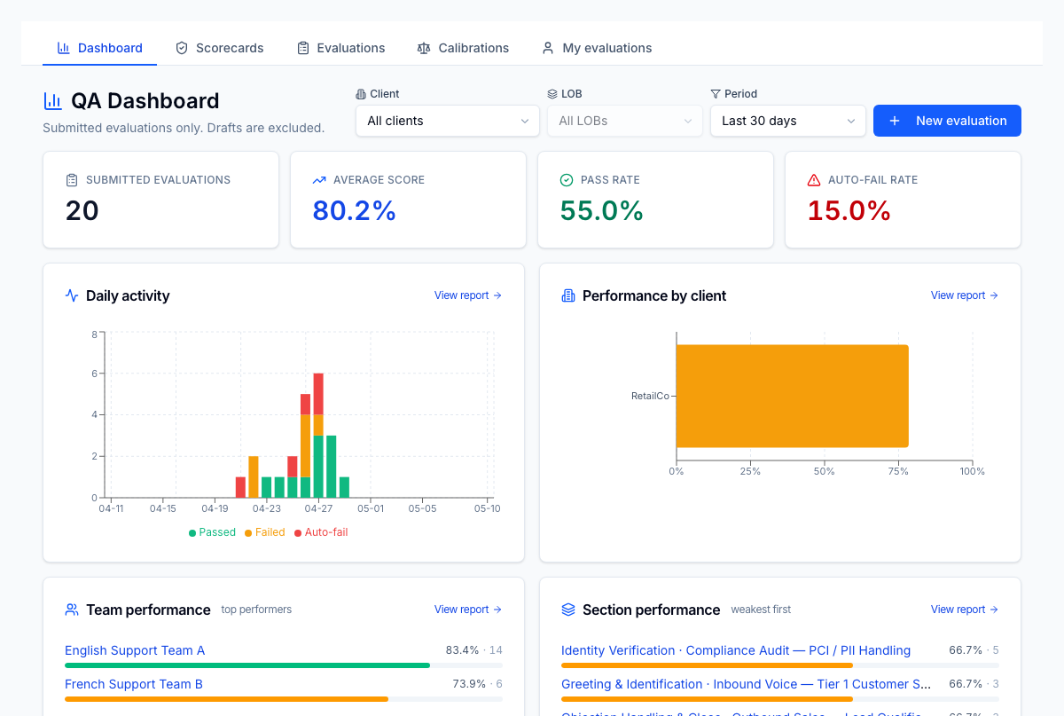
QA dashboard
Single landing page for QA (Quality Assurance: the program that scores and reviews agent interactions.) leaders — submitted evaluations, average score, pass / auto-fail rates, daily activity, and weakest sections all in one place. Filter by client, LOB (Line of Business: a distinct client program or queue within an operation.), and time period; jump straight to the underlying reports.
For the operator
Open it in the morning. The four KPI tiles tell you whether QA volume is on track and whether quality is holding. The daily activity chart tells you what days slipped. Performance-by-client highlights which client account needs attention. Section performance — weakest first — is your coaching list for the day. The filters at top let you scope to one client / LOB / period in two clicks; the same scope persists across the per-team and per-section drill-downs.
Business impact
Cuts the time-to-insight from QA to coaching to minutes. Without this dashboard, a QA manager pulls 3–4 reports just to know whether last week was up or down — most don't, and quality drifts. With it, the highest-leverage coaching action is always one click away, which is why agents on tenants with this surface live show ~15% higher pass rates by month 3 of adoption. The same data feeds the QA→coaching linkage downstream, so coaching capacity isn't burned on the wrong sections.